Do you want to know how well your social media profiles compare to your competitors? Find out how you can use Fanpage Karma to set up benchmarks for your industry and evaluate your own profiles.
Benchmarks are comparative values against which you can measure your own performance. Let’s say BMW sold 2 million cars last month. Is that good or bad? Depends on how many the other car companies have sold. If the others sold an average of 5 million cars, BMW is below this benchmark and did badly. If the benchmark is 1 million cars, BMW is above average.
In this guide we will show you step by step how to use Fanpage Karma to find out the benchmarks for your own industry and which features you can use to graphically display the results. Let’s get started!
(Click to enlarge a screenshot.)
1. Add All Competitors to a Dashboard
With a social media dashboard you can quickly and easily measure the success of different social media profiles. To create a dashboard, follow these steps:
- Click on “+ Dashboard” in the dashboard overview
- Give the new dashboard a name
- Click on “+ profile” at the bottom left
- Select a network
- Enter the profile name in the search
- Select the profile in the search results
- Repeat the process until you have added all your competitors and your own profiles on all networks relevant to you
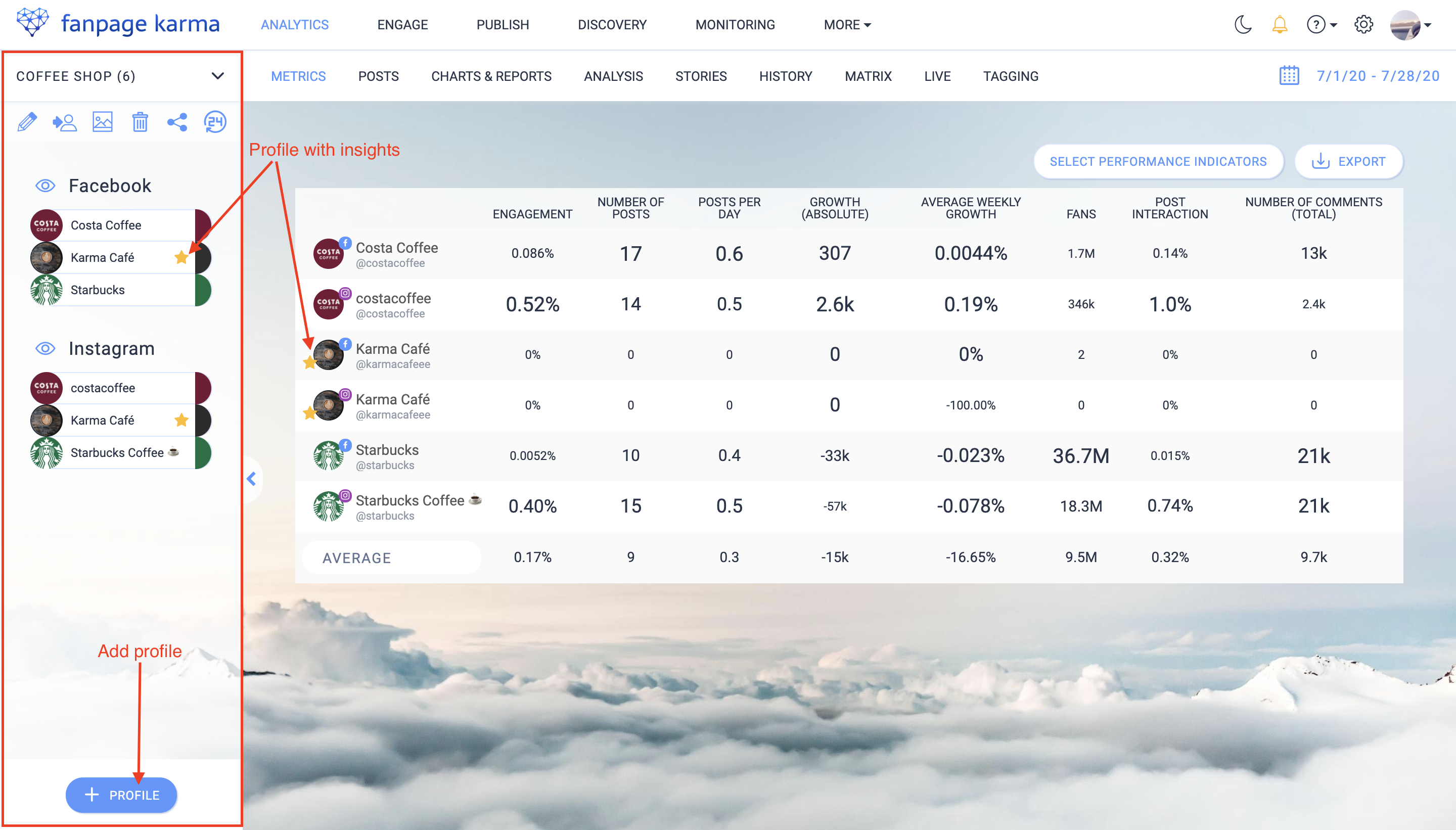
The profiles are now part of your dashboard and can be found in the left column.
Info: For your own profiles, i.e. the profiles whose administrator you are, you have more key figures available for evaluation than for external profiles. These key figures are called Insights. Insights include, for example, reach, click or story metrics. Profiles with Insights are marked with a yellow star in the dashboard.
2. Use the Metrics Table to Find Benchmarks
The best tool to display all important key figures (including averages) for all profiles of your dashboard at a glance is the metrics table. You can find it under the “metrics” tab in the dashboard.
How to Set the Table
- Click on “select key figures”
- Delete all metrics from the selection that you don’t need by clicking on the trash can in the mouseover
- Click on “add key figures” to select further key figures
- Select the key figures for which you want to set up benchmarks (make sure to select only public key figures); our key figure tip for getting started: fans, engagement, post interaction, growth, posts per day
- Confirm with “ok”
- Determine the order of the key figures according to your wishes by drag-and-drop and save
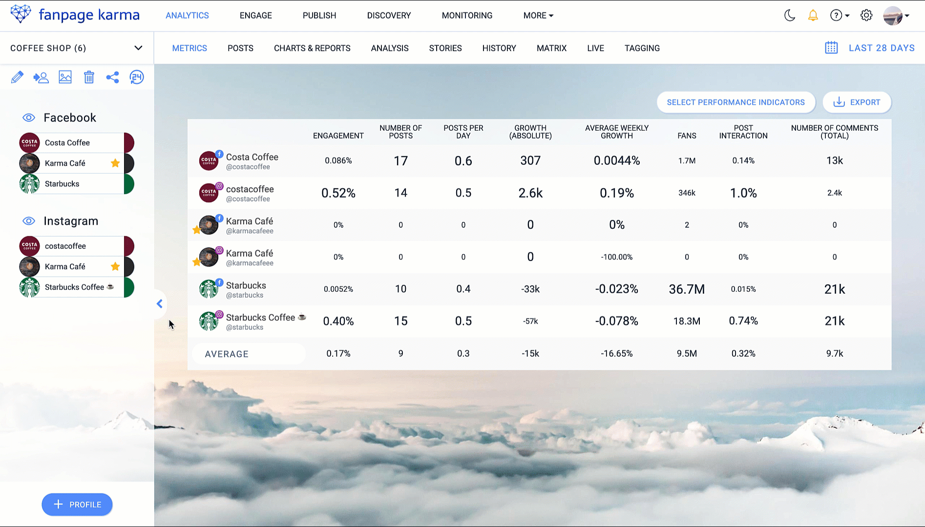
The table is now full of data that you can take the benchmarks from.
Tip: If you want to view networks separately, you can hide all profiles or networks in the profile bar that should not be included.
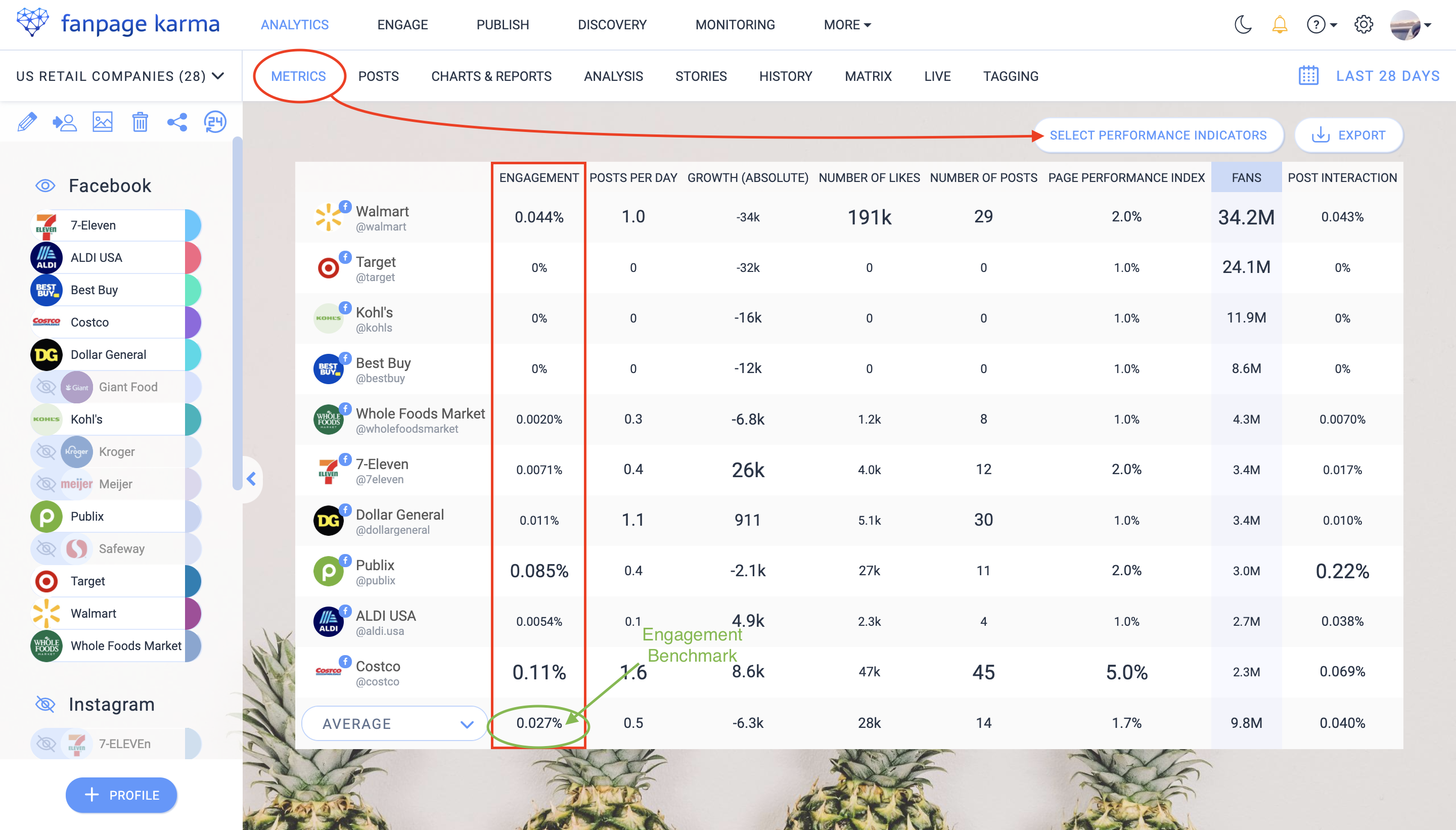
Identifying Benchmarks
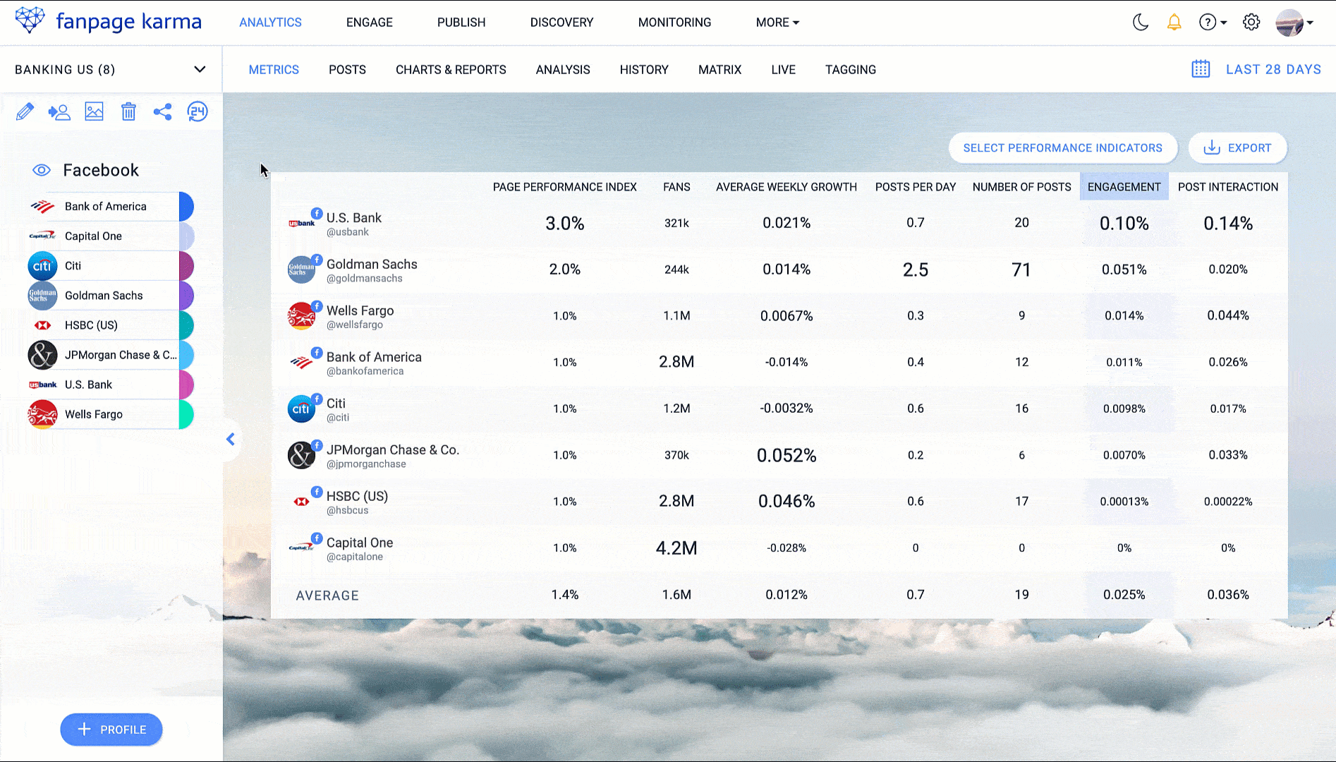
You can see that the values in the table are displayed in different sizes, the highest being the largest and the lowest being the smallest (a form of display that you can disable if you want). In the bottom row of the table are summarized values. You can choose between average, median and sum. The averages are the benchmarks of your industry.
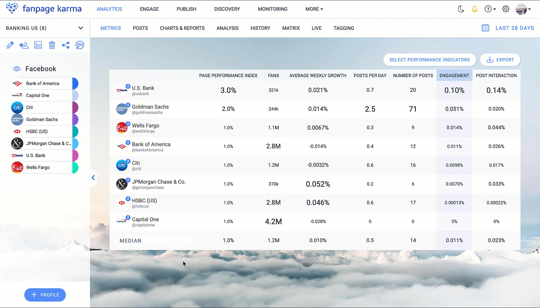
In the screenshot you can see the metrics table of a dashboard of the American banking industry. The red area shows the average values, i.e. the benchmarks, for the selected key figures. The benchmark for posts per day is 0.7. With 2.5 posts per day, Goldman Sachs has posted significantly more than that. Bank of America, on the other hand, published lies way beneath the benchmark with only 0.4 posts per day. They should post more in order to keep up with their competitors.
Identify all the benchmarks of your industry in the table and find out whether your profile lies below or above them.
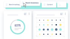
3. Visualize Data
To also get a visual impression of the performance of your profiles and that of your industry, you should use the chartboard.
- Go to the “charts & reports” section of a dashboard
- Click on the report dropdown and select the report template “Benchmarking”, here we have prepared a selection of charts for you, which are suitable for benchmarking
- Select a period
- Make sure that all profiles you want to evaluate are visible in the profile bar
- Optional: create additional charts by clicking on “+ chart” at the bottom of the page
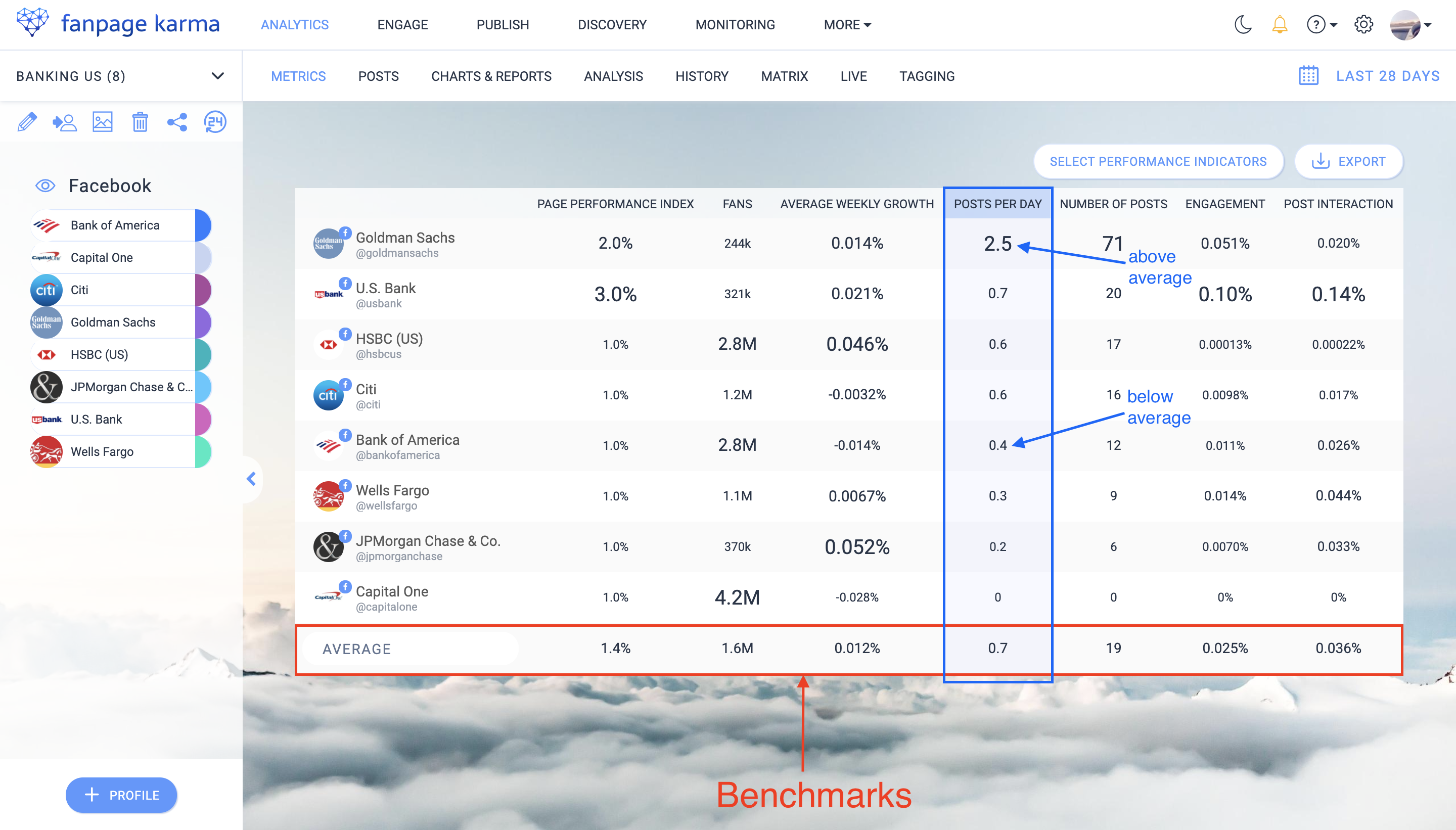
The different types of graphs make it easy to compare performance. For example, in the bar chart at the top right you can see that Capital One is the top performer in terms of the number of followers. But if you look at the growth graph at the bottom left, you will see that the profile shows extreme negative growth.
Tip: Export the chartboard as PowerPoint or PDF by clicking on the “Download” button or subscribe to it monthly or weekly by e-mail by checking the appropriate boxes.
4. Identify Top Performers at a Glance
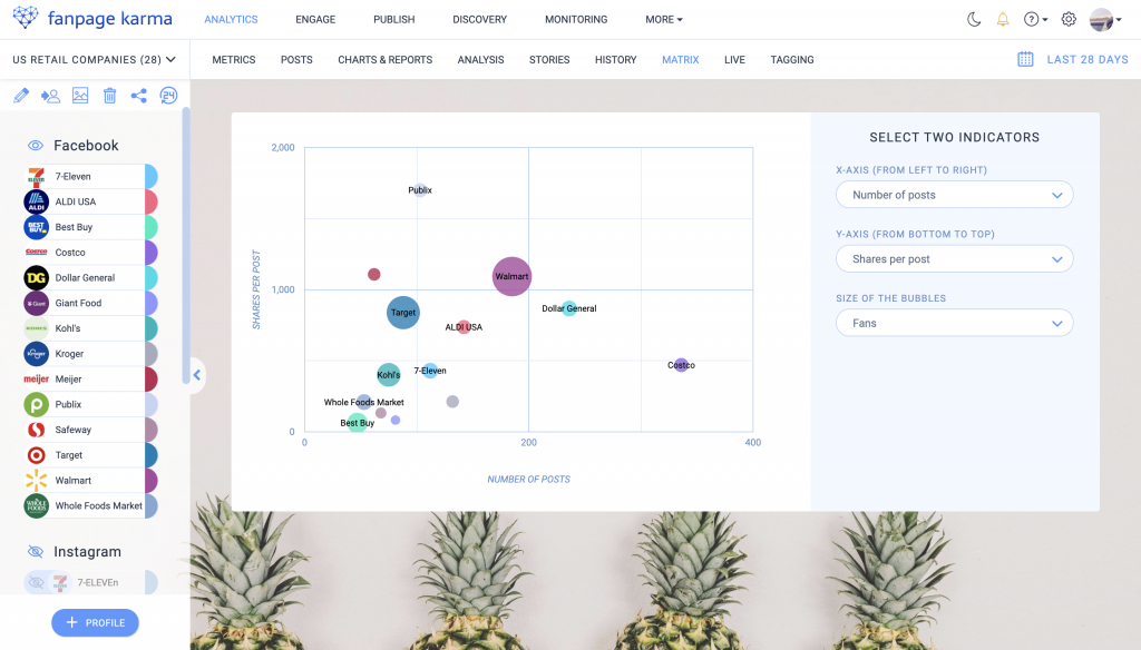
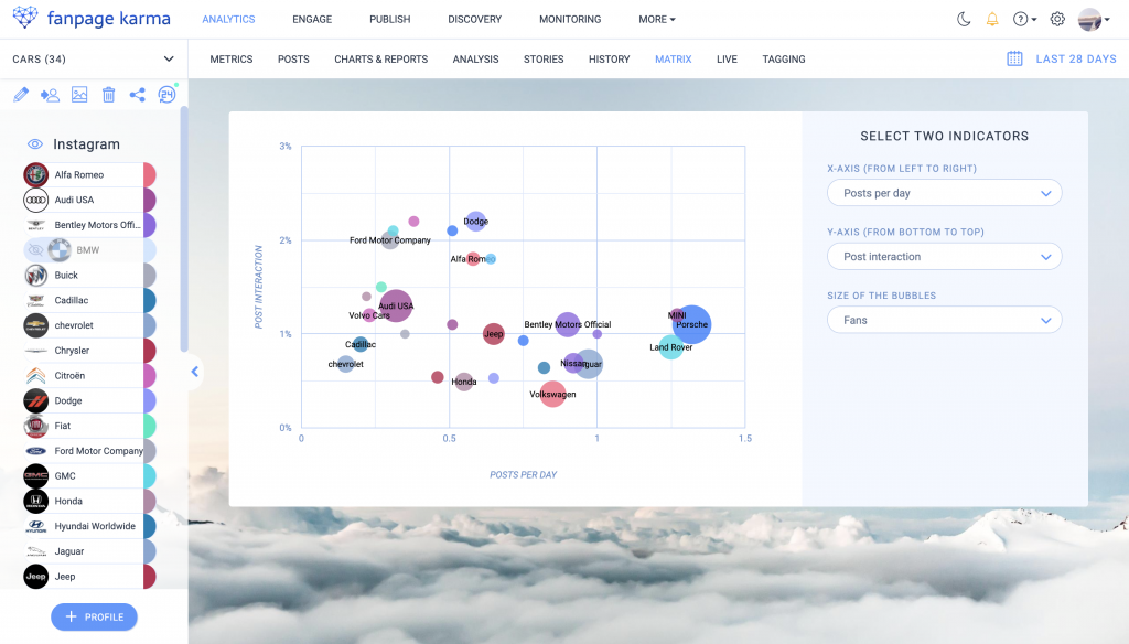
The matrix is a special graph that you can use to show the performance of several profiles in relation to three different key figures. Two axes span a field on which the profiles are positioned as circles. Each axis and the size of the circles represent one key figure. The aim of a profile should be to be positioned as far to the top right as possible.
You can find the matrix under the “matrix” tab in the dashboard.
How to set up a matrix
- Go to a dashboard under “matrix”
- Choose three key figures that are relevant for you
- Find your profile in the matrix
Matrix Evaluation
The top performers in terms of the three selected indicators are those profiles that have the largest circles and are located at the top right of the matrix.
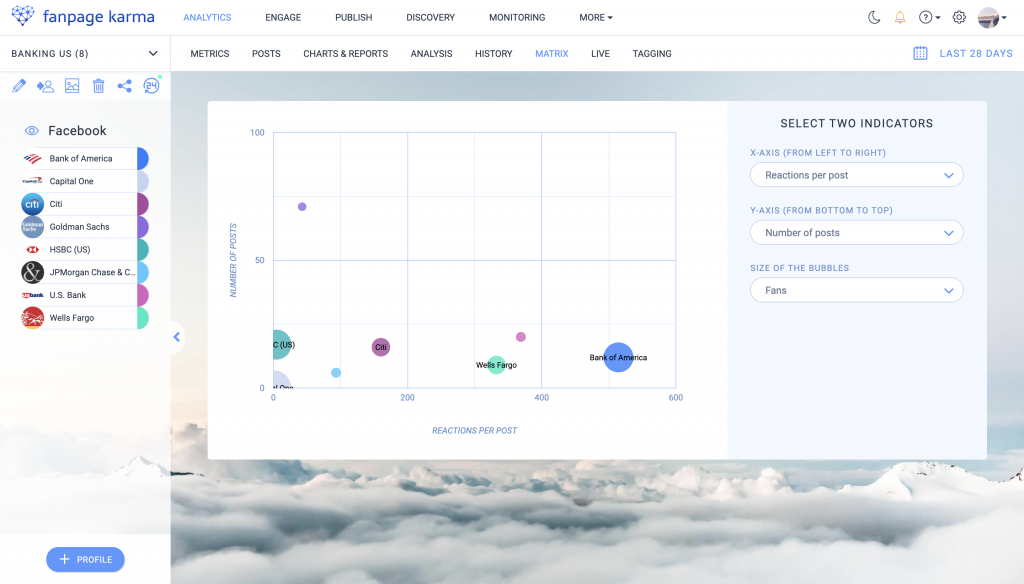
From the location of your profile in the matrix you can draw the following conclusions for your strategy (example key figures: number of posts, post interaction, fans):
Bottom left: You post very little and get few interactions on your posts, you should post more often and make sure to improve your content. You can do this, for example, by making your content more relevant to your audience, by making sure you post when your audience is online, or by using more call-to actions to encourage them to interact.
In this article we have collected helpful tips for creating good content: https://blog.fanpagekarma.com/2020/02/28/how-companies-should-post-content-social-media-marketing-guide/
Top left: You post very little, but you get a lot of interaction. Your content is good, your target group feels spoken to and becomes active. You should produce more content of this kind and post more regularly.
Tip: Preplan your content in the editorial calendar and publish posts automatically, this saves time and you don’t have to post manually each time.
Bottom right: You post a lot, but receive very little interaction. Your content is not appealing enough and you should improve it.
Top right: You are in the right place! You post regularly and receive a lot of interaction, your content suits your target group. Keep it up!
5. History
Here is a feature that allows you to display the development of your performance over longer periods of time, compare periods of time and compare key figures, the history graph. You can find it under the “history” tab in the dashboard.
For example, if you ask yourself at the end of the month how much your profile has grown compared to the previous month, you can easily visualise it.
- Hide all profiles in the profile bar that you do not want to display in the graph
- Select the period of the previous month in the top right corner
- Select the key figure fans in the drop-down menu above the graph
- Select the “Second period” under “Add comparative data”
In the graph you can see two lines, a continuous one for the past month and a dashed one for the previous month.
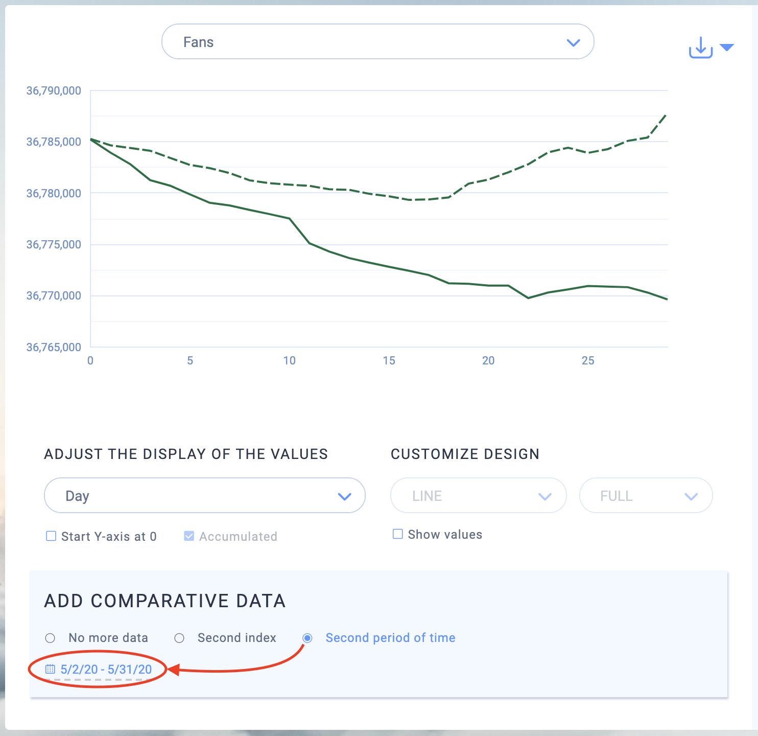
The screenshot shows Starbucks‘ followers for the month of June 2020 compared to the month of May 2020, and you can see that the profile initially lost followers in May, but grew nicely again at the end of the month, thus keeping the number of followers stable. In June, on the other hand, there is a significant loss of followers. That poses questions that need to be investigated. Has anything changed in the content strategy? Have the users become more dissatisfied or have they lost interest?
To get to the bottom of the matter, take the follower number and relate it to another key figure. In the Starbucks example, it would make sense to investigate whether there was a decline in engagement alongside the number of followers in June. To check this:
- Select “Second key figure” under “Add comparative data”
- Select the key figure ” engagement” in the key figure dropdown
- Check the box “cumulated”, in order to display the values in the graph as a sum
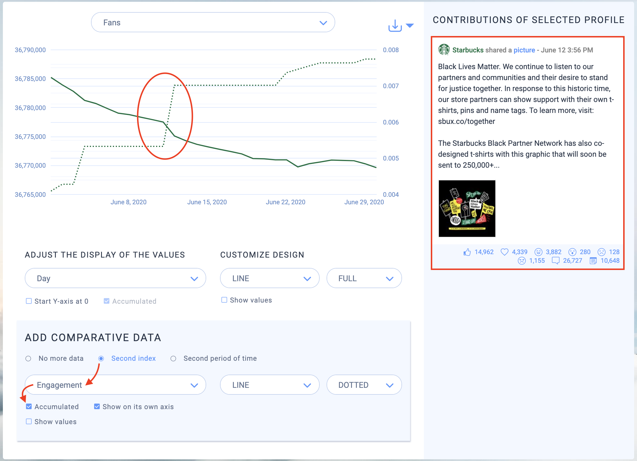
As you can see in the chart, the engagement of Starbucks is exactly antagonistic to its growth in June. The profile has lost followers while users have become more interactive with its content. An interesting discovery.
There’ s something else that stands out: On June 11th, Starbucks‘ engagement suddenly skyrocketed and the number of followers dropped sharply. At this time, something seems to have happened on the profile that has caused a stir among users. Hovering your mouse over the engagement graph and clicking on the time at which the rise begins will show you the posts that were made that day on the right. In this case, there was only one post in which the company showed solidarity with the Black Lives Matter movement. A topic that was probably perceived as controversial among the followers. (Whether the steep drop in the fan curve is certainly related to this can ultimately only be determined by checking the users comments).
6. Observe Your Industry in Real Time
Next, you should enable the live feature for your dashboard to keep up to date with the latest happenings on the profiles for your industry.
- Click on the live icon in the left bar of the dashboard
- Set the check mark for “Real time updates enabled”
- Save
- Wait 10 minutes while Fanpage Karma gathers first data
- Click on the “live” tab of the dashboard
Tip: If the profiles of the dashboard are not posting a lot, you should wait about 24 hours to ensure that enough data is available.
Now you can check what currently happens on the profiles of your industry at any time.
Many different graphics give you an overview of the latest posts, the topics being discussed, the mood among users and much more.
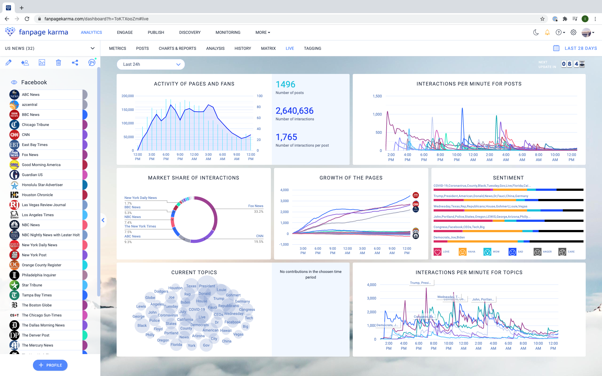
The screenshot shows a live board of American news profiles on Facebook and their activities of the last 24 hours. In the pie chart, for example, you can see that Fox News collects the most interactions with 33%. The graph to the right shows that BBC News is the fastest growing profile right now. The sentiment graph reveals which emotions are associated with certain topics.
Now It’ s Your Turn!
Assessing your performance compared to the rest of your industry is fundamental to social media management. It’s the only way to know where you stand and to be able to leverage the information you collect to improve your strategy and increase your reach and clicks. Have a go!
Do you have any questions? Then let us know at service@fanpagekarma.com!