
In order to quickly see whether you are getting closer to your social media goals or not, you should measure yourself against past performance. With Fanpage Karma, you can compare data from different time periods and display the differences in charts and tables. This is how it’s done!
Activate and Select Comparison Period
As soon as you have activated the “Comparison” switch in the time selection window in the top right-hand corner, you can select which periods you would like to compare with each other. You can choose from a set of standard time periods or enter your own individual time periods using the calendar or input fields.
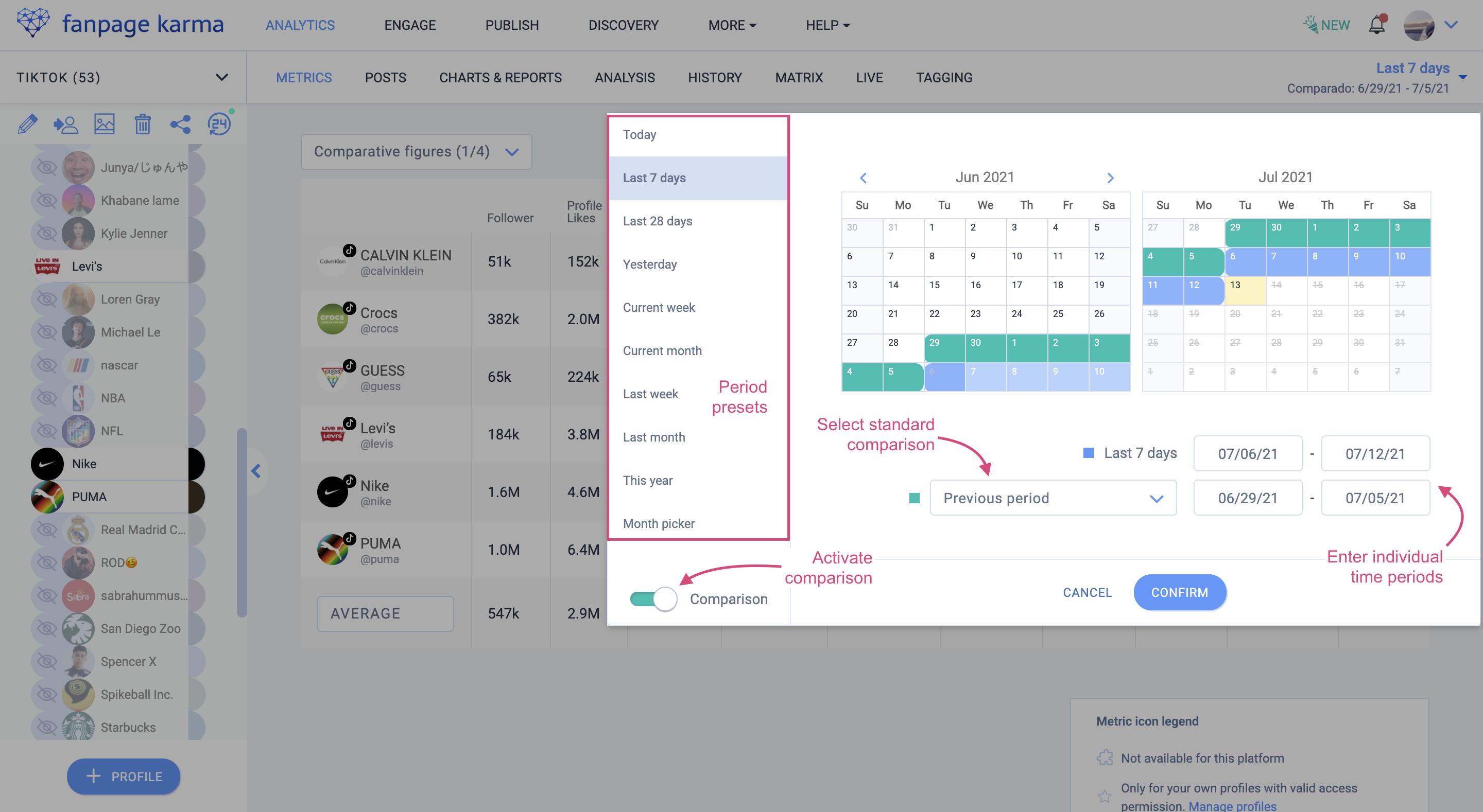
If you want to find out, for example, whether key figures have improved compared to the previous week, select the standard period “last 7 days” for the primary period in the selection on the left. The comparison period is now automatically set to the previous period, i.e. the last seven days before. Depending on your application, it may be useful to change the comparison period, for example, to the same period in the previous month or previous year. These standard comparisons can be easily selected in the drop-down menu. If you want to choose your own periods, you can of course select them manually in the calendar or enter them in the input fields.
Metrics Table: All Comparison Values at a Glance
Once you have selected a comparison period, a new dropdown appears in the “Metrics” area at the top left of the table, which you can use to set which comparison values you would like to display.
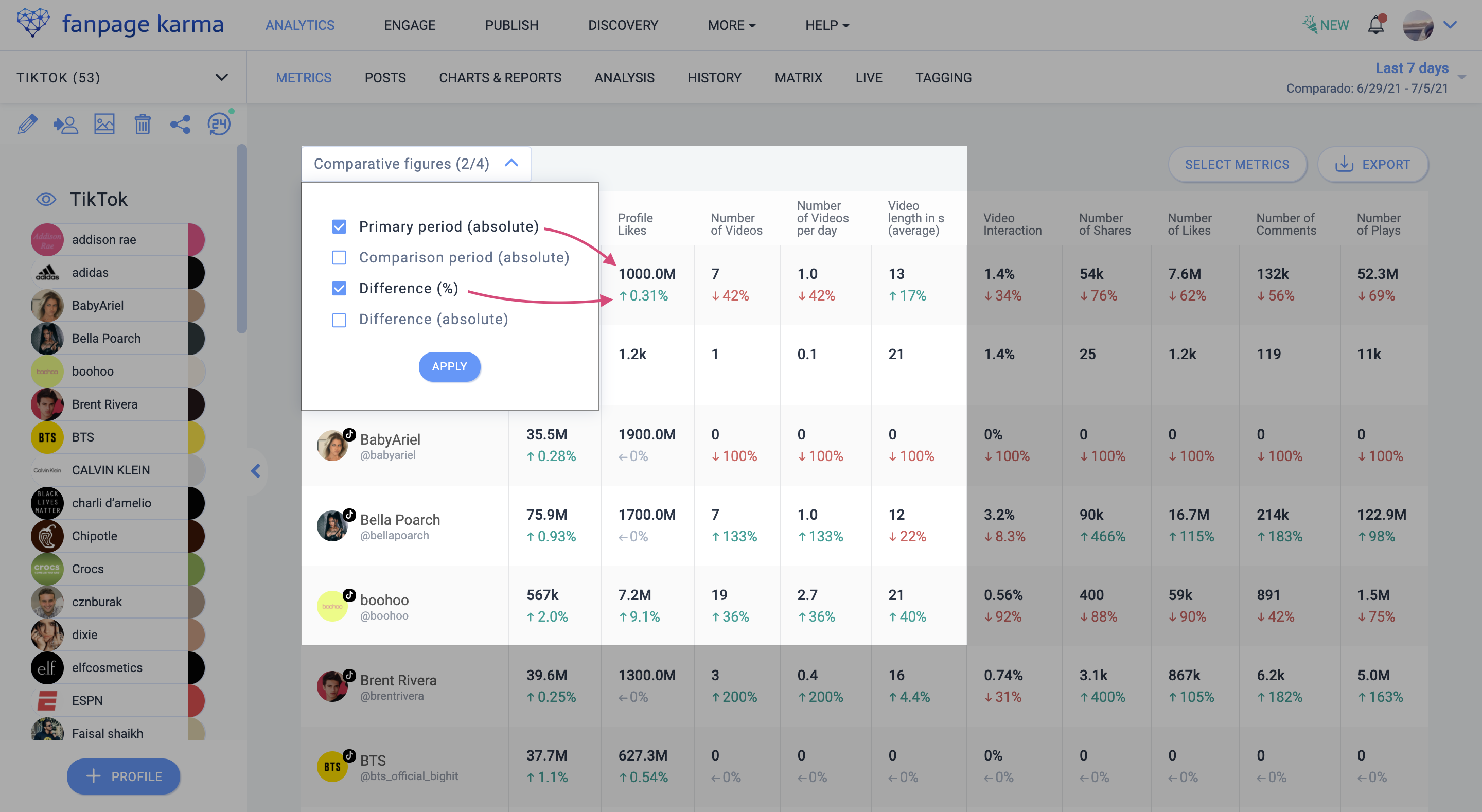
You could, for example, choose to show the absolute values of the primary period and the difference in percentage to the comparison period. The difference is shown in green if the values have increased and in red if they have decreased. This makes it clear at a glance whether the performance of the selected profiles has improved or deteriorated.
Charts: Presenting Comparisons Graphically
To get a visual idea of how profiles have developed at different times, you can use the charts in the “Charts & Reports” section. Here you can see, for example, that Mercedes had a significantly lower post-interaction this week than last week.
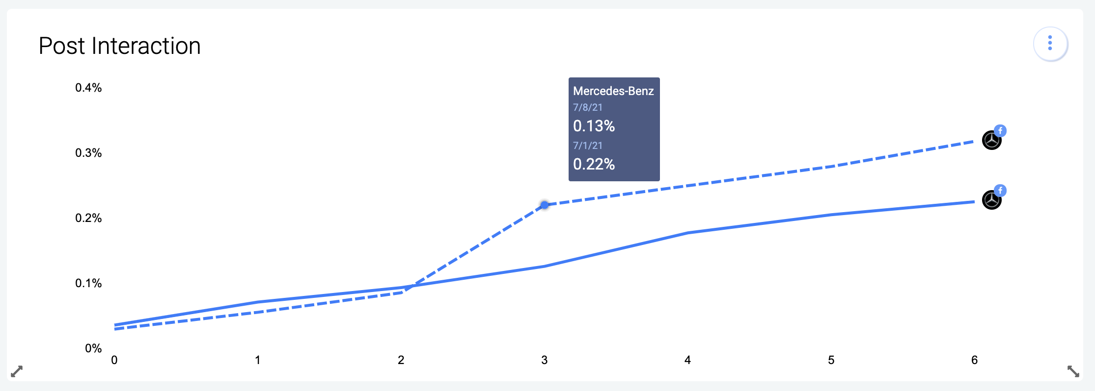
Hovering over a point in the graph, the exact values of the two periods are displayed.
In the bar chart, the comparison periods are shown to the left of the primary period in transparent color. In this example, you can see that Louis Vuitton posted the most on Facebook last week. This week, however, Mercedes posted more.
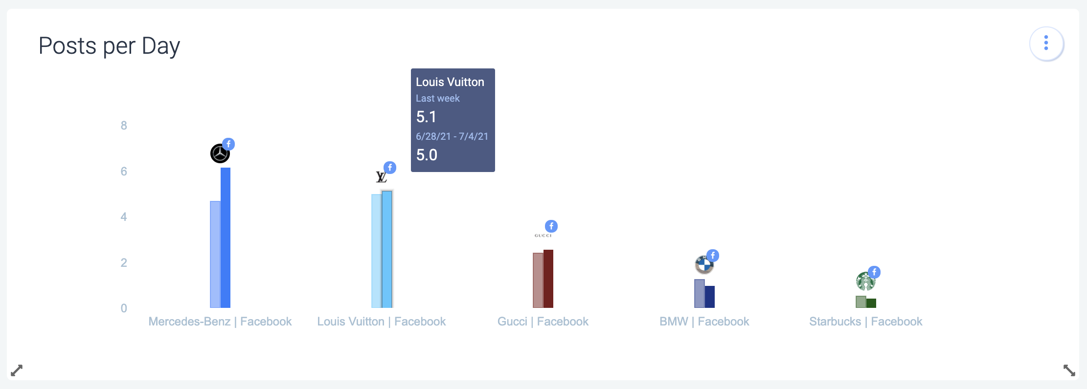
Comparing periods is available for all line, bar, single indicator and top posts charts.
Now it’s your turn!
The period comparison helps you to quickly see in which areas your profiles have improved or deteriorated and makes these differences very clear. Try it out right away! If you are new to Fanpage Karma, you can test all functions for two weeks for free!
